How to create and customize Bootstrap tooltips (with examples)
A tooltip is a small pop up that appears when user places mouse pointer over an element such as link, button, icon or any other element to provide information about the element being hovered.
How to create a Tooltip?
To create a tooltip, we need to add data-toggle=”tooltip” attribute to an element. We need to use title attribute to display the tooltip text when mouse is hovered on an element.
Now, let’s see how to create Bootstrap tooltip.
<!DOCTYPE html>
<html lang="en">
<head>
  	<title>Bootstrap Tooltip Example</title>
  	<meta charset="utf-8">
  	<meta name="viewport" content="width=device-width, initial-scale=1">
  	<link rel="stylesheet" href="http://maxcdn.bootstrapcdn.com/bootstrap/3.3.7/css/bootstrap.min.css">
  	<script src="https://ajax.googleapis.com/ajax/libs/jquery/1.12.0/jquery.min.js"></script>
<script src="http://maxcdn.bootstrapcdn.com/bootstrap/3.3.7/js/bootstrap.min.js"></script>
</head>
<body>
	<div class=”container”>
		<div class="row"style="margin-bottom:50px;"><div class="col-lg-12"></div></div>
		<a href="#" data-toggle="tooltip" title="Some text on hovering on me.">Hover mouse over me</a>
	</div>
</body>
</html>
The output of above HTML sample is shown in following screenshot:
 Screenshot 1
In the screenshot 1, we can see that text specified in title attribute is shown in tooltip box whose background-color is black.
Customizing the Tooltip
We can observe from screenshot 1 that tooltip is always displayed in rectangle shape without small arrow sign and by default, tooltip is shown always on bottom right position. To display bootstrap tooltip with small arrow sign, we can use following jquery script.
<script>
$(document).ready(function(){
    		$('[data-toggle="tooltip"]').tooltip();
});
</script>
With above jquery code, following output is displayed.
 Screenshot 2
From screenshot 2, we can see that tooltip is displayed in little circled rectangle and at top.
Setting directions of Tooltip
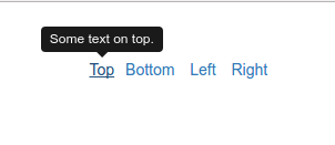
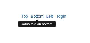
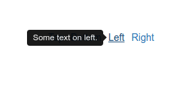
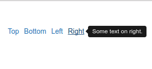
By default, tooltip is shown at top position of an element. We can set directions (top, bottom, left, right) to show tooltip with data-placement attribute as follows:
<div class=”container”>
<div class=”row”style=”margin-bottom:50px;”><div class=”col-lg-12″></div></div>
<a href=”#” data-toggle=”tooltip” data-placement=”top” title=”Some text on top.” >Top</a>
<a href=”#” data-toggle=”tooltip” data-placement=”bottom” title=”Some text on bottom.”>Bottom</a>
<a href=”#” data-toggle=”tooltip” data-placement=”left” title=”Some text on left.”>Left</a>
<a href=”#” data-toggle=”tooltip” data-placement=”right” title=”Some text on right.”>Right</a>
</div>
The above HTML sample shows the positions of tooltip on hovering of links in screenshot 3.


Screenshot 3
So, we can see that how simple and pretty it is to create nicely looked tooltips with bootstrap.
