Creating Bootstrap dropdowns in Bootstrap v4
Dropdowns are used to display lists of links, names etc. Bootstrap dropdowns can be toggled by clicking on it.
1.Create a file with .html extension.
2.Include bootstrap css and js version 4 CDN link in the html file.
Example –
<!doctype html>
<html lang="en">
  <head>
    <!-- Required meta tags -->
    <meta charset="utf-8">
    <meta name="viewport" content="width=device-width, initial-scale=1, shrink-to-fit=no">
<link rel="stylesheet" href="https://maxcdn.bootstrapcdn.com/bootstrap/4.0.0/css/bootstrap.min.css">
<script src="https://code.jquery.com/jquery-3.2.1.slim.min.js" ></script>
<script src="https://cdnjs.cloudflare.com/ajax/libs/popper.js/1.12.9/umd/ popper.min.js"> </script>
<script src="https://maxcdn.bootstrapcdn.com/bootstrap/4.0.0/js/ bootstrap.min.js"> </script>
<title>Bootstrap Dropdowns</title>
 </head>
 <body>
<div class="container">
/************Add your dropdown code here**************\
</div>
 </body>
</html>
3. How to write Dropdown code:
There are two types of bootstrap dropdowns:
Single button dropdowns
Split button dropdowns
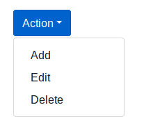
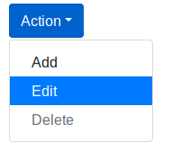
In the Single button dropdowns, the dropdown arrow and the button are merged together and any button can be converted to dropdown toggle. Here is an example of single button dropdown:
<div class="dropdown">
  	<button class="btn btn-primary dropdown-toggle" type="button" id="dropdownBtn" data-toggle="dropdown" aria-haspopup="true" aria-expanded="false">Action</button>
  	<div class="dropdown-menu" aria-labelledby="dropdownBtn">
    		<a class="dropdown-item" href="#">Add</a>
    		<a class="dropdown-item" href="#">Edit</a>
    		<a class="dropdown-item" href="#">Delete</a></div>
	</div>
</div>
The output of the example will look something like this:
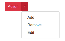
2. In the split button dropdown, the class named .dropdown-toggle-split separates the dropdown arrow by adding some margin.Here is an example of split button dropdown:
<div class="btn-group">
  	<button type="button" class="btn btn-danger">Action</button>
  	<button type="button" class="btn btn-danger dropdown-toggle dropdown-toggle-split" data-toggle="dropdown" aria-haspopup="true" aria-expanded="false">
    		<span class="sr-only">Toggle Dropdown</span>
  	</button>
  	<div class="dropdown-menu">
  		<a class="dropdown-item" href="#">Add</a>
    		<a class="dropdown-item" href="#">Remove</a>
    		<a class="dropdown-item" href="#">Edit</a>
  	</div>
</div>
The output of the example will look something like this:
Other variations for Dropdown Menus
In the dropdowns there are other variations that can be added to the parent element such as:
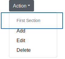
1.DropDown Header – The class .dropdown-header is used to add headers inside the dropdown menu.
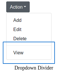
2.DropDown Divider – The class .dropdown-divider is used to separate links inside the dropdown menu with a thin horizontal line. For example:
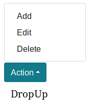
3.DropUp – The .dropup class is used to show menus above the button. For example:
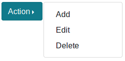
4.DropRight – The .dropright class is used to show the menus to the right of the dropdown button. For example:
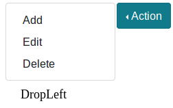
5.DropLeft – The .dropleft class is used to show the menus to the left of the dropdown button. For example:
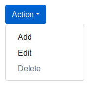
6.Disable Dropdown – The .disabled class is used to deactivate the clickable links in the dropdown. For example:
7.Active DropDown – The class .active is used to show active links in the dropdown. For example:

One comment