Usage of Progress Bar
Progress bars are used to display the progress of a process in a computer, update/progress of a task or action of a user. For example:
- Survey or Voting results are filled with the bars in a percentage format.
- Progress of uploading a file can be shown in the form of bars with percentages.
- In your checkout process, you may see how many steps are completed by way of the progress bar.
Types of Progress Bars
Bootstrap 4 provides various types of progress bars. Let’s have a look at the following types of progress bars.
Create a default Bootstrap Progress Bar: To create a simple progress bar, add a ‘.progress’ class to the container and add the ‘.progress-bar’ to its child element.
<div class="progress">
    <div class="progress-bar" style="width: 50%"></div>
</div>
The output of the above sample HTML will come out as follow:
 Screenshot 1
Before creating bootstrap progress bars, make sure to include all necessary jquery and bootstrap files in your webpage.
Setting Height of Progress Bar: Default height of progress bar is 16px. To change the height of the progress bar, the CSS property height can be used. The height of progress and progress-bar container must be the same.
<div class="progress" style="height:40px;">
    <div class="progress-bar" style="height:40px; width: 50%"></div>
</div>
 Screenshot 2
It can be seen from screenshot 1 and 2 that the progress-bar of screenshot 2 has more height than the progress-bar of screenshot 1.
Creating a Labelled Progress-Bar: Sometimes it is better to know by what percentage the progress has been completed and what is left. In this case, a labeled progress bar is used The task completion percentage can be displayed in the form of text inside the progress-bar.
<div class="progress">
    <div class="progress-bar" style="width:60%;">60%</div>
</div>
The labelled progress-bar looks like as shown in the following screenshot:

As we can see from the above screenshot, text/label 60% is displaying inside the progress-bar.
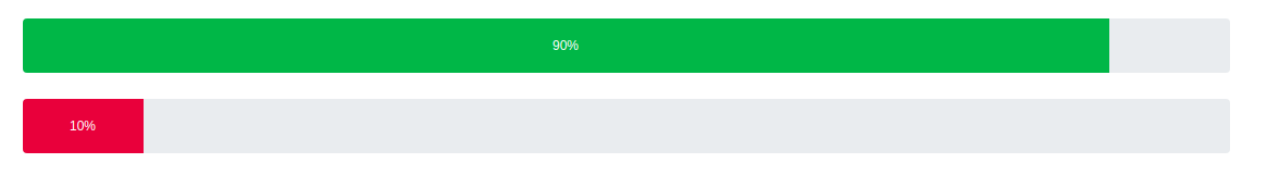
Creating a colored Progress Bar: The default color of the bootstrap 4 progress-bar is blue. Color of progress-bar can be set with bootstrap contextual classes.
<div class="progress" style="height:50px;">
    <div class="progress-bar bg-success" style="width:90%;height:50px;" >90%</div>
</div>


<div class="progress" style="height:50px;">
    <div class="progress-bar bg-danger" style="width:10%; height:50px;">10%</div>
</div>
Output is:
Other bootstrap background contextual classes are: bg-warning, bg-info, bg-white, bg-secondary, bg-light and bg-dark
Creating Striped Progress-Bar: To create the striped progress-bar, just an extra class ‘.progress-bar-striped’ is needed to add to the ‘.progress-bar’ element.
<div class="progress" style="height:50px;">
        <div class="progress-bar progress-bar-striped" style="width:90%;height:50px;">90%</div>
</div>
The output is:

Creating Animated Progress-Bar: To create the animated progress-bar, just an extra class ‘.progress-bar-animated’ is needed to add to the ‘.progress-bar’ and ‘.progress-bar-striped’ element.
<div class="progress" style="height:50px;">
    <div class="progress-bar progress-bar-striped progress-bar-animated" style="width:90%;height:50px;" >90%</div>
</div>

Creating Stacked Progress-Bar: Sometimes the requirement comes where we have to divide 100% into different sections and show how much each section is occupying from this 100%. In this case we use stacked progress bars. We can create stacked progress-bars as shown below:
<div class="progress" style="height:50px;">
     <div class="progress-bar bg-success" style="width:50%;height:50px;" >50% success</div>
     <div class="progress-bar bg-warning" style="width:20%;height:50px;" >20% warning</div>
     <div class="progress-bar bg-danger" style="width:20%;height:50px;" >10% danger</div>
</div>
The output is:
