Display Progress Circle according to Percentage on Web page
Sometimes, the requirement arises to display progress circle with the percentage value.
For example :
1. Various social networking or professional websites depict the percentage of user profile completed with a circular progress bar.
2. In online shopping website percentage of stock left of a product can be shown.
3. In eLearning website progress of the student in a course can be depicted with it.
This can be implemented with a Jquery plugin.
Please click this link :
http://www.jqueryscript.net/demo/Dynamic-Circular-Progress-Bar-with-jQuery-CSS3/
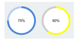
It will display demo of circle progress bar as shown below :
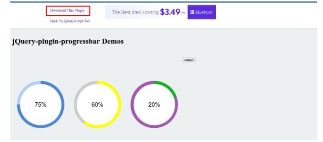
SCREENSHOT 1
1. With following steps, this plugin can be used on your website easily :
2. Click on Download This Plugin shown at top left of screenshot 1 and download files on your local system.
Now, in your webpage’stag, add required bootstrap 3 and jQuery files. It is optional to add bootstrap files. Jquery file is mandatory to add.
3. Include following plugin file intag :
<script src=”jQuery-plugin-progressbar.js”></script>
4. For CSS file inclusion, It is up to user. Plugin CSS file can be put in project or your own CSS can be made and put in the project. Then CSS can be included intag. I preferred to use second approach, means css file is created and copied required classes in CSS file and include that file in.
5. Now, add following CSS classes either in separate CSS file or intag, if using the second approach from step 5. Change highlighted CSS from following if using the first approach in step 5.
<style>

  .progress-bar {

  position: relative;

  height: 100px;

  width: 100px;

  background-color:#fff;        // change this highlighted css if using first approach of step 5

  box-shadow: inset 0 -1px 0 rgba(0,0,0,0);

  color: #000;

}

.progress-bar div {

  position: absolute;

  height: 100px;

  width: 100px;

  border-radius: 50%;

}

.progress-bar div span {

  position: absolute;

  font-family: Arial;

  font-size: 25px;

  line-height: 75px;

  height: 75px;

  width: 75px;

  left: 12.5px;

  top: 12.5px;

  text-align: center;

  border-radius: 50%;

  background-color: white;

}

.progress-bar .background { background-color: #b3cef6; }

.progress-bar .rotate {

  clip: rect(0 50px 100px 0);

  background-color: #4b86db;

}

.progress-bar .left {

  clip: rect(0 50px 100px 0);

  opacity: 1;

  background-color: #b3cef6;

}

.progress-bar .right {

  clip: rect(0 50px 100px 0);

  transform: rotate(180deg);

  opacity: 0;

  background-color: #4b86db;

}

@keyframes

toggle {  0% {

 opacity: 0;

}

 100% {

 opacity: 1;

}

}

  </style>
6. Now, add empty div element in body of web page :
<body>

    <div class="row">

<div id=”percentage”>65</div>

     <div class="col-lg-4 col-md-4 col-sm-4">

     <div class="progress-bar"></div>

     </div>

       </div>

</body>
7. Now, in js file of plugin, loading function contains following script :
$.fn.loading = function () {

     var DEFAULTS = {

     backgroundColor: '#b3cef6',

     progressColor: '#4b86db',

     percent: 75,

     duration: 2000

     };
If you want to show different colors based on different range of values, then you have to add little bit more javascript. It is not mentioned in plugin, but I added because in my project, requirement arises to show circle based on range of values.
Suppose, you want to show :
a) red circle for percentage < 50%,
b) orange circle for >=50% and < 70%
c)Green circle for >= 70%
Then add the following javascript code before DEFAULTS variable and inside loading function :
var percentage = $('#percentage').text();    // it is div in webpage which contains percent value

  if(percentage >= 70)

    progressBarColor = 'green';

else if(percentage >= 50 && percentage < 70)

    progressBarColor = 'orange';

else

    progressBarColor = 'red';
And now, change DEFAULTS variables as shown below :
var DEFAULTS = {

     backgroundColor: '#b3cef6',

     progressColor: progressBarColor,

     percent: percentage,

     duration: 2000

     };
8. Now, try with different values of percent by changing text in div having id “percentage”.
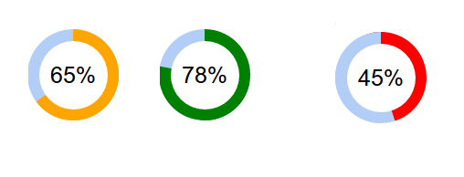
SCREENSHOT 2
9. From screenshot 2, we can see different colors and circle length is displaying based on percent value range.
10. From Screenshot 2, we can see that default remaining circle color is light sky blue. If we want to change remaining circle color, one more parameter (that is, background-color) in DEFAULTS variable in js file can be changed.
var DEFAULTS = {

     backgroundColor: 'rgb(239, 239, 239)',
11. Now, color of remaining circle is changed.
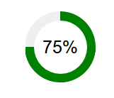
SCREENSHOT 3