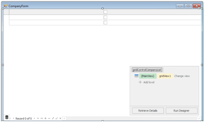
From the toolbox window, check the Data and Analytics section in the toolbox menu and drag & drop the GridControl on your windows form.
Devexpress Grid control uses Views to present data from a bound data source. With the help of views records and fields appearance and behaviour with different display formats and editing options can be controlled in various ways. There are different types of views available like GridView, BandedGridView, AdvBandedGridView, LayoutView, CardView etc. which mainly inherits from BaseView and its descendant, an abstract ColumnView.
We can control the view appearance, behaviour and variety of other settings through its grid control designer window that appears when we click the “Run Designer” button. The settings can also be managed at run time for the view on which we are working.
Currently applied view to Grid can be accessed from MainView Grid Control to display required data and manipulate settings of grid.
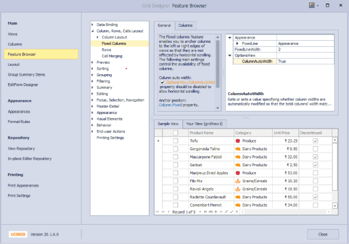
Below is the screenshot of the designer window, we have different types of components sections to control grid behaviour like Views, Columns, Feature Browser etc.
There are different binding modes like ADO.NET data sets SQL data, Entity Framework data, XML data, Excel data sources, LinQ To SQL etc. are supported.
Code below shows the use of List object instances as the data source and we bind the list data source at runtime as follows:
 public class Company

    {

        public Guid CompanyId { get; set; }

        public string CompanyName { get; set; }

        public string Status { get; set; }                       // Active/Inactive

        public string Street { get; set; }

        public string City { get; set; }

        public string State { get; set; }

        public string Zip { get; set; }

        public string Country { get; set; }

        public string Phone { get; set; }

        public string Fax { get; set; }

        public string Email { get; set; }

        public string WebAddress { get; set; }

    }
Binding Columns and data source in Grid Control:
Let’s say gridControlCompanyList is the name of the grid and then we can set the datasource of the grid control as follows:
gridControlCompanyList.DataSource = companyList;

//companyList is object instance of List<Company>
We can bind and control the display format of columns using MainView accessed with GridView type as shown in the following
a snippet of code :
 GridView view = gridControlCompanyList.MainView as GridView;

            GridColumn column1 = view.Columns.Add();

            column1.Caption = "CompanyId";

            column1.FieldName = "CompanyId";

            column1.Visible = false;

            GridColumn column2 = view.Columns.Add();

            column2.Caption = "Company Name";

            column2.FieldName = "CompanyName";

            column2.Visible = true;

            column2.Width = 300;

            GridColumn column3 = view.Columns.Add();

            column3.Caption = "Is Active?";

            column3.FieldName = "CompanyId";

            column3.Visible = true;

            column3.Width = 300;
Column Customization:
We can customize display of a column content based on some criteria or some specific column, then we will assign the handler method to CustomColumnDisplayText Handler of the view as follows:
view.CustomColumnDisplayText += gridMainView_CustomColumnDisplayText;
Below is the sample method attached to CustomColumnDisplayText Handler of the view representing the use of the displaying custom text to the user.
private void gridMainView_CustomColumnDisplayText(object sender, CustomColumnDisplayTextEventArgs e)

{           if (e.Column.FieldName == "Status")

            {

                e.DisplayText = e.Value.ToString().ToLower() == "active" ?"Yes":"No";

            }

 }
Here original column text is customized to display yes/no instead of Active/Inactive.
Row Style Customization:
Similarly, we can customize row appearance based on criteria decided from the data of the record. For this, we will use the RowStyle handle of the grid view.
view.RowStyle += gridMainView_RowStyle;
Below sample attached method to RowStyle Handle represents basic
private void gridMainView_RowStyle(object sender,DevExpress.XtraGrid.Views.Grid.RowStyleEventArgs e)

{

            GridView View = sender as GridView;

            if (e.RowHandle >= 0)

            {

                String status = Convert.ToString(

                 View.GetRowCellDisplayText(e.RowHandle, View.Columns["Status"]));

                // We need to take care in case text is customized, like we shown in previous sample code

                //with yes/no

                if (status.ToLower() == "inactive" || status.ToLower() == "no")

                {

                    e.Appearance.BackColor = Color.Salmon;

                    e.Appearance.BackColor2 = Color.SeaShell;

                    e.HighPriority = true;

                }

            }

 }
Handling Multiple Selection of Records:
To allow multiple selections of rows through checkboxes, you will need to set the following properties for OptionsSelection in the view.
MultiSelectMode = CheckBoxRowSelect, MultiSelect = True
We can get the selected records from the grid as follows:-
public List<Company> GetSelectedCompanies()

  {

                List<Company> selectedCompanies = new List<Company>();

                ColumnView view =  gridControlCompanyList.MainView as ColumnView;

                Int32[] selectedRowHandles = view.GetSelectedRows();

                for (int i = 0; i < selectedRowHandles.Length; i++)

                {

                    int selectedRowHandle = selectedRowHandles[i];

                    if (selectedRowHandle >= 0)

                    selectedCompanies.Add(view.GetRow(selectedRowHandle) as Company);

                }

                return selectedCompanies;

 }
With this customization, grid will look like this –
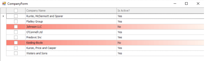
Red rows indicate companies with inactive status.