Introduction
Bootstrap is a popular HTML, CSS, and JavaScript framework for developing a responsive and mobile-friendly website. It includes jumbotron, table, button, grid, form, image, alert, wells, container, carousel, panels, glyph icon, badges, labels, progress bar, pagination, pager, list group, dropdown, collapse, tabs, pills, navbar, inputs, modals, tooltip, popover, and scrollspy.
Here we will be discussing Bootstrap Panel
The panel is a bordered box with padding around its element. The components are used when you put your DOM component in a box.
The class .panel is used within the <div> element to create the panels. The .panel-body class is the content inside the panel.
Generally, a panel contains three parts:
- Panel header
- Panel content
- Panel footer
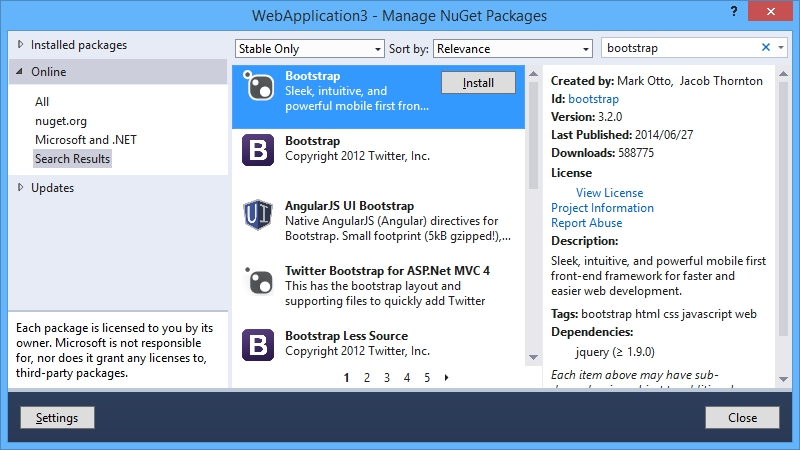
Before moving to the next step one important thing is :
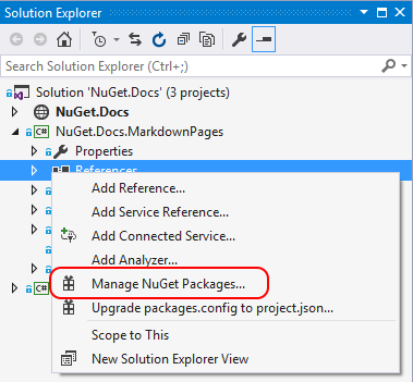
Add Bootstrap Package Solution Explore >> NuGet Package Manager >> Select Browser >> Search bootstrap.
Install that package.
Bootstrap Panel Group
The panel group is used to group panels together.
For a panel group, you have to wrap a <div> with class .panel-group around them. The .panel-group class clears the bottom-margin of each panel.
Example:
<!DOCTYPE html>
<html lang="en">
<head>
<title>Bootstrap Example</title>
<meta charset="utf-8">
<meta name="viewport" content="width=device-width, initial-scale=1">
<link rel="stylesheet" href="https://maxcdn.bootstrapcdn.com/bootstrap/3.4.0/css/bootstrap.min.css">
<script src="https://ajax.googleapis.com/ajax/libs/jquery/3.4.1/jquery.min.js"></script>
<script src="https://maxcdn.bootstrapcdn.com/bootstrap/3.4.0/js/bootstrap.min.js"></script>
</head>
<body>
<div class="container">
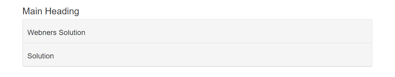
<h2>Main Heading</h2>
<p class="text-md-center"></p>
<div class="panel panel-default">
<div class="panel-heading custom_class">
<h3>Webners Solution</h3>
<p class="text-md-left"></p>
</div>
<div class="panel-heading custom_class">
<h3> Solution</h3>
<p class="text-md-left"></p>
</div>
</div>
</div>
</body>
</html>
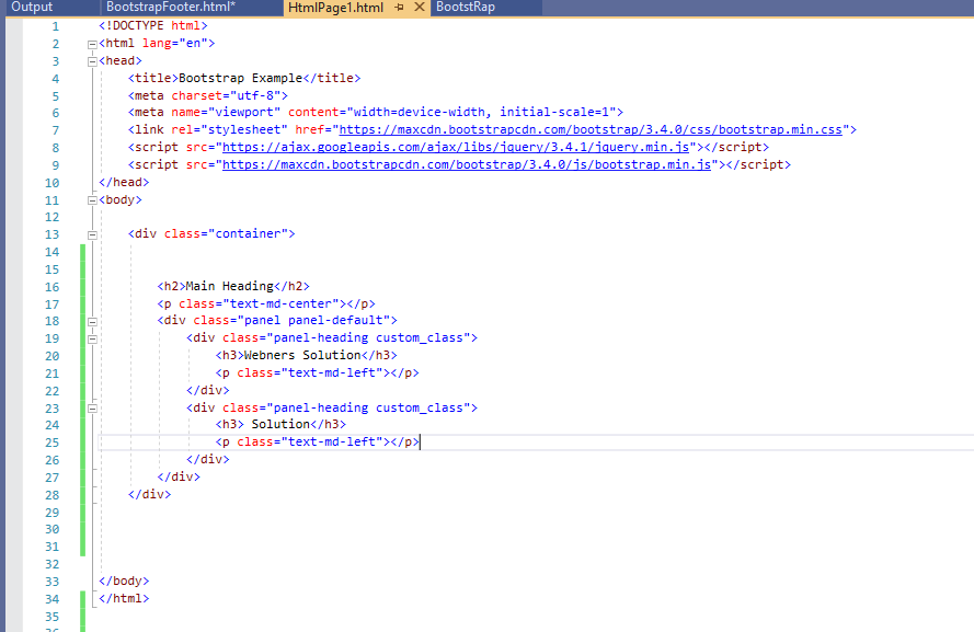
In Visual Studio the code shows like this:
OUTPUT
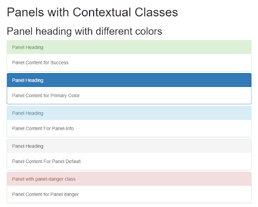
Bootstrap Panel with contextual classes
Contextual classes use to color the panels using (.panel-default, .panel-primary, .panel-success, .panel-info, .panel-warning, or .panel-danger).
Example:
<!DOCTYPE html>

<html lang="en">

<head>

    <title>Bootstrap Example</title>

    <meta charset="utf-8">

    <meta name="viewport" content="width=device-width, initial-scale=1">

    <link rel="stylesheet" href="https://maxcdn.bootstrapcdn.com/bootstrap/3.4.0/css/bootstrap.min.css">

    <script src="https://ajax.googleapis.com/ajax/libs/jquery/3.4.1/jquery.min.js"></script>

    <script src="https://maxcdn.bootstrapcdn.com/bootstrap/3.4.0/js/bootstrap.min.js”></script>

</head>

<body>

 <div class="container">

        <h1>Panels with Contextual Classes</h1>

        <h2>Panel heading with different colors</h2>

       <div class="panel-group">

            <div class="panel panel-success">

                <div class="panel-heading">Panel Heading</div>

                <div class="panel-body">Panel Content for Success</div>

            </div>

<div class="panel panel-primary">

                <div class="panel-heading">Panel Heading</div>

                <div class="panel-body">Panel Content for Primary Color</div>

            </div>

 <div class="panel panel-info">

                <div class="panel-heading">Panel Heading</div>

                <div class="panel-body">Panel Content For Panel-Info </div>

            </div>

 <div class="panel panel-default">

                <div class="panel-heading">Panel Heading</div>

                <div class="panel-body">Panel Content For Panel Default</div>

            </div>

   <div class="panel panel-danger">

                <div class="panel-heading">Panel with panel-danger class</div>

                <div class="panel-body">Panel Content for Panel danger</div>

            </div>

        </div>

    </div>

</body>

</html>
OUTPUT
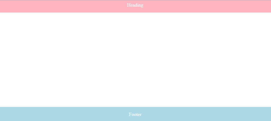
Panel Footer
The panel-footer is a class used to add a footer to the panel. In this, we use Panel Content and Panel Footer whereas Panel Content we write body in the content panel.
Example:
<!DOCTYPE html>

<html><head>

    <meta name="viewport" content="width=device-width, initial-scale=1">

    <style>

        .footer { position: fixed;

            left: 0;

            bottom: 0;

            width: 100%;

            background-color: lightblue;

            color: white;

            text-align: center;  }

.Heading {position: fixed;

            left: 0;

            bottom: 90%;

            width: 100%;

            background-color: lightpink;

            color: white;

            text-align: center; }

    </style>

</head>

<body>

 <div class="container">

 <div class="footer">

            <p>Footer</p>

</div>

 <div class="Heading">

            <p>Heading</p>

        </div>

</div>

</body>

</html>
OUTPUT