Lightning Accordion
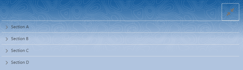
Lightning Accordion is used to display the content in sections that can be displayed and hidden in a single click. There can be multiple sections in an accordion that can be expanded or collapsed independently of each other, using the arrow key provided on the left side of each section.
You can choose to select if you want to open the accordion with one or more active sections by making changes to your component’s JS file. By default, only one section is opened at a time but you can modify your JS file and choose to keep multiple active sections at a time.
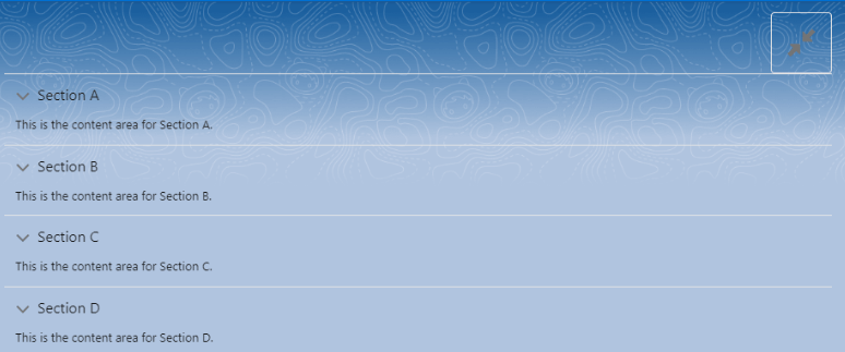
Here, we are going to use a button that opens all the sections at once with the command of a single button:
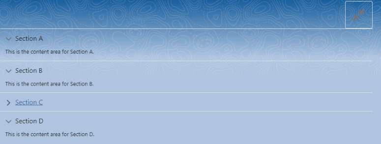
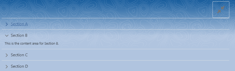
While using the button to open all the sections at once, we can also use the arrow keys to open or close a single section:
Here’s the JS Code for the component:
import { LightningElement } from 'lwc';

export default class AccordionExample extends LightningElement {

    activeSections = [];

    handleSectionToggle(event) {

        if(this.activeSections.length > 0){

            this.activeSections = [];

        }

        else{

            this.activeSections = ['A','B','C','D'];

        }

    }

}
Here’s the HTML file code:
<template>

    <lightning-accordion allow-multiple-sections-open active-section-name={activeSections}>

        <div class="slds-clearfix">

            <div class="slds-float_right">

                <lightning-icon class="slds-box slds-text-heading_small" icon-name="utility:contract_alt" alternative-text="Expand/Collpase" title="Expand/Collpase" onclick={handleSectionToggle}>

                </lightning-icon>

            </div>

        </div>

        <lightning-accordion-section name="A" label="Section A">

            <p>This is the content area for Section A.</p>

        </lightning-accordion-section>

        <lightning-accordion-section name="B" label="Section B">

            <p>This is the content area for Section B.</p>

        </lightning-accordion-section>

        <lightning-accordion-section name="C" label="Section C">

            <p>This is the content area for Section C.</p>

        </lightning-accordion-section>

        <lightning-accordion-section name="D" label="Section D">

            <p>This is the content area for Section D.</p>

        </lightning-accordion-section>

    </lightning-accordion>

</template>