Learn How to create Bootstrap Carousel
The carousel is a slideshow for cycling through a series of content. It is also known as image slider. It also includes support for next and previous controls.
Now, let’s see how to create Bootstrap Carousel.
First of all, include jquery and required bootstrap files in head section of html.
<!DOCTYPE html>
<html lang="en">
<head>
  <title>Bootstrap Label Example</title>
  <meta charset="utf-8">
  <meta name="viewport" content="width=device-width, initial-scale=1">
  <link rel="stylesheet" href="http://maxcdn.bootstrapcdn.com/bootstrap/3.3.7/css/bootstrap.min.css">
  <script src="https://ajax.googleapis.com/ajax/libs/jquery/1.12.0/jquery.min.js"></script>
<script src="http://maxcdn.bootstrapcdn.com/bootstrap/3.3.7/js/bootstrap.min.js"></script>
  <style>
  img{
      width:100%;  // Add this css if you want to take 100% width of image, otherwise there will be blank space on right side of image
  }
  </style>

</head>
<body>
    <div class="container">
        <div id="sliderCarousel" class="carousel slide" data-ride="carousel">
            <ol class="carousel-indicators">
                <li data-target="#sliderCarousel" data-slide-to="0" class="active"></li>
                <li data-target="#sliderCarousel" data-slide-to="1"></li>
                <li data-target="#sliderCarousel" data-slide-to="2"></li>
            </ol>
            <div class="carousel-inner" role="listbox">
                <div class="item active">
                         <img src="/home/user/Downloads/Images_download/1.jpg" alt="Moon2">
                  </div>
                  <div class="item">
                    <img src="/home/user/Downloads/Images_download/2.jpg" alt="Target">
                  </div>
                  <div class="item">
                    <img src="/home/user/Downloads/Images_download/3.jpg" alt="Flower">
                  </div>
            </div>

            <a class="left carousel-control" href="#sliderCarousel" role="button" data-slide="prev">
                <span class="glyphicon glyphicon-chevron-left" aria-hidden="true"></span>
                <span class="sr-only">Previous</span>
             </a>
              <a class="right carousel-control" href="#sliderCarousel" role="button" data-slide="next">
                <span class="glyphicon glyphicon-chevron-right" aria-hidden="true"></span>
                <span class="sr-only">Next</span>
              </a>
        </div>
        </div>
   </div>
</body>
</html>
The output of above HTML sample is:

Screenshot 1
Description of Carousel classes used in above HTML sample:
Carousel indicators: These are little dots at the bottom of each slide image. The indicators are specified in an ordered list with class .carousel-indicators .
Carousel indicators have following attributes:
- The data-target attribute specifies the id of the carousel. In above HTML sample, id of Carousel is “#sliderCarousel”.
- The data-slide-to attribute specifies the slide image or content to show on click of dot. In the screenshot 1, if we click on third dot, then third slide image will be displayed.
- Slides or Slider images or content: The div with class ‘carousel-inner’ specifies the slide item. Slide can be any content. Each slide can contain image or text.
Each slide content is put in a div with class “item”.
Left and Right Carousel Controls: These are left and right buttons to go to previous and next slide manually on click of these buttons.
Other operations which can be performed on Carousel
Adding Captions to slides
Caption can be added to each slide by adding
<div class=”carousel-caption”> in each <div class=”item”>
<div class="carousel-inner" role="listbox">
            <div class="item active">
                    <img src="/home/user/Downloads/Images_download/1.jpg" alt="Moon2">
                     <div class="carousel-caption">First slide</div>
              </div>
              <div class="item">
                   <img src="/home/user/Downloads/Images_download/2.jpg" alt="Target">
                    <div class="carousel-caption">Second slide</div>
              </div>
              <div class="item">
                    <img src="/home/user/Downloads/Images_download/3.jpg" alt="Flower">
                    <div class="carousel-caption"></div>
              </div>
</div>
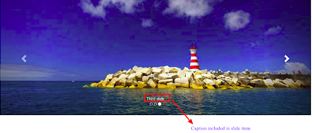
Screenshot 2
Changes on Carousel with Bootstrap API via Javascript
Carousel can be called manually via Javascript as:
<script>
    $(document).ready(function(){
        $('#sliderCarousel').carousel();            // sliderCarousel is of carousel
    });
</script>
For using carousel via Javascript, we don’t need data-ride, data-target, data-slide-to etc classes in html sample because we are handling them through Javascript methods.
Carousel Options
| Option | Default | Description |
| interval | 5000 | The amount of time delay between automatic cycling of slides. |
| keyboard | true | Whether carousel should react to keyboard events |
| pause | hover | If set to “hover”, cycling of carousel is paused on mouseenter and resumed on mouseleave. If set to false, hovering on carousel will not pause cycling of slide item |
| ride | false | Autoplays the carousel after the user manually cycles the first item. If “carousel” autoplays the carousel on load. |
| wrap | true | Whether the carousel should cycle continuously or have hard stops. |
Carousel options can be used with Javascript as shown in example below:
$('#sliderCarousel').carousel({
    interval: 2000    // with this option value, slide item will cycle to next slide after 2 seconds.
});
Similarly, other options can be used. I have shown one option as example to depict how to use carousel options in Javascript.
Carousel Methods
Carousel methods can be used with Javascript either on page load or on any button click event. Carousel provides the following events:
| Method | Description |
| .carousel(options) | Initializes the carousel with option(s) |
| .carousel(“cycle”) | Cycles through the carousel slides items from left to right |
| .carousel(“pause”) | Stop the cycling of carousel slide items |
| .carousel(number) | Cycles to the particular slide item (first item is 0, second is 1, and so on) |
| .carousel(“prev”) | Goes to the previous slide item |
| .carousel(“next”) | Goes to the next slide item. |
This is one more example of how to use carousel methods:
$(‘.button’).click(function(){
    $('#sliderCarousel').carousel(‘pause’);
});
Similarly other methods can be used.
Carousel Events
Bootstrap’s carousel provides two events for hooking into carousel functionality.
| Event | Description |
| slide.bs.carousel | This event fires when carousel is about to slide from one item to another |
| slid.bs.carousel | This event is fired when carousel completes its slide transition |
Following example depicts how to use above events:
$("#sliderCarousel'").on('slide.bs.carousel', function () {
            alert('A new slide is going to be shown!');
 // alert will be shown whenever new slide is going to be displayed by carousel
  });