We can move elements on background screen using CSS properties.
Below @keyframes rule specifies the animation code and “movement” gives a name to the animation:
@keyframes movement {
    0 % {
        background - position: 0 px 0 px,
        0 px 0 px,
        0 px 0 px
    }
    50 % {
        background - color: #FFA07A
    }
    100 % {
        background - position: 500 px 1000 px,
        400 px 400 px,
        300 px 300 px;
        background - color: #E9967A;
    }
}
//for different browsers use this syntax instead
@ - moz - keyframes movement {}
@ - ms - keyframes movement {}
@ - webkit - keyframes movement {}

//If an animation has the different starting and ending properties, then we can define like 0%{ } ,50%{ },1000%{ }.

// If an animation has the same starting and ending properties, one way to do that is to comma-separate the 0% and 100% values:

@keyframes movement {
    0 % , 100 % {
        background - position: 0 px 0 px,
        0 px 0 px,
        0 px 0 px
    }
}
Calling keyframe animation with separate properties:
body {
    background - color: #6b92b9;
 background-image: url('images/main2.png'), url('images/main.png'), url('image/star.png');
    -webkit-animation: movement 20s linear infinite;
    -moz-animation: movement 20s linear infinite;
    -ms-animation: movement 20s linear infinite;
    animation: movement 20s linear infinite;
}
There is the possibility to add different background images like in above example which will display on a browser as a single image.
This is the result we got using this CSS:
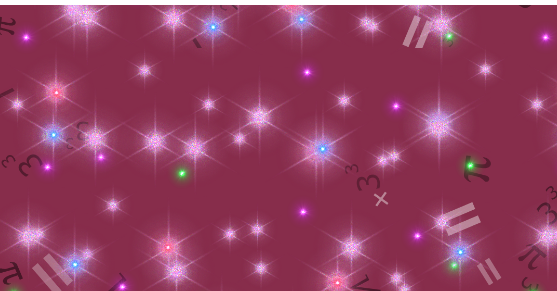
All the math symbol star are moving in the browser.
Note:
// -webkit-animation:  used for  chrome 43.0 ,  4.0 .
-moz - animation: used
for firefox 16.0, 5.0. -
    ms - animation: used
for older browser.