Bootstrap Grid System and Breakpoints
Bootstrap Grid System
The Bootstrap Grid System uses the strategy of mobile first. Bootstrap Grid System divides the screen into 12 columns which can be joined to create wider columns according to the size of the screen (laptop or mobile).
When a grid of a particular size is declared then it will be a perfect fit for that size. We don’t have to define anything for extra small devices since the default is one column. We have to define a grid size for small devices, but not for medium devices. This is because the grid cascades up. So if you define a size at sm, then it will be that grid size for sm, md, and lg.
Grid Classes :
The Bootstrap Grid System Consists of following four classes :
The classes above can be combined to create more dynamic and flexible layouts.
Working of Bootstrap Grid System
Grid systems are used for creating page layouts through a series of rows and columns that contains the content of the website. The working is as follows:
Bootstrap Breakpoints (Media Queries)
Media Query is a term used for conditional CSS rule. Media Queries in Bootstrap allow you to move, show and hide content based on the screen size. These queries include “less than”, “max-width”, “min-width” . If the conditions are met then the effects are visible.
Examples of the bootstrap grid system are as follows.
<div class="col-xs-12 col-sm-12  col-md-10 col-md-offset-1 col-lg-8 col-lg-offset-2 form-outer">
<br>
  <div class="users form onsiteForms" >
 	 <?php echo $this->Session->flash('auth'); ?>
 	 <?php echo $this->Form->create('User',array('action' => '/login')); ?>
  <div class="form-group">
	<label for="Fname">Login Id<span class="asterisk"> *</span></label>
	<?php echo $this->Form->input('email',array('label'=>false,'class'=>'form-control'));?>
  </div>
  <div class="form-group">
	<label for="email">Password<span class="asterisk"> *</span></label>
	<?php echo $this->Form->input('password',array('label'=>false,'class'=>'form-control'));?>
  </div>
  <div style="text-align: center">
          <?php echo $this->Form->submit('Login', array('class' => 'css3button', 'title' => 'Submit'));
              echo $this->Form->end()?>
  </div>
  <div class="create-link">
<a href="www.test.com/Users/register" title="Sign Up" id="SiteLabels">Create An Account </a>
  </div>
  <div class="forgot-link">
 	  <a title="Get new password" href="www.test.com/Users/ForgotPassword" id="SiteLabels">Forgot your password?</a>
  </div>
  </div>
  </br>
  </br>
</div>
Screenshot:
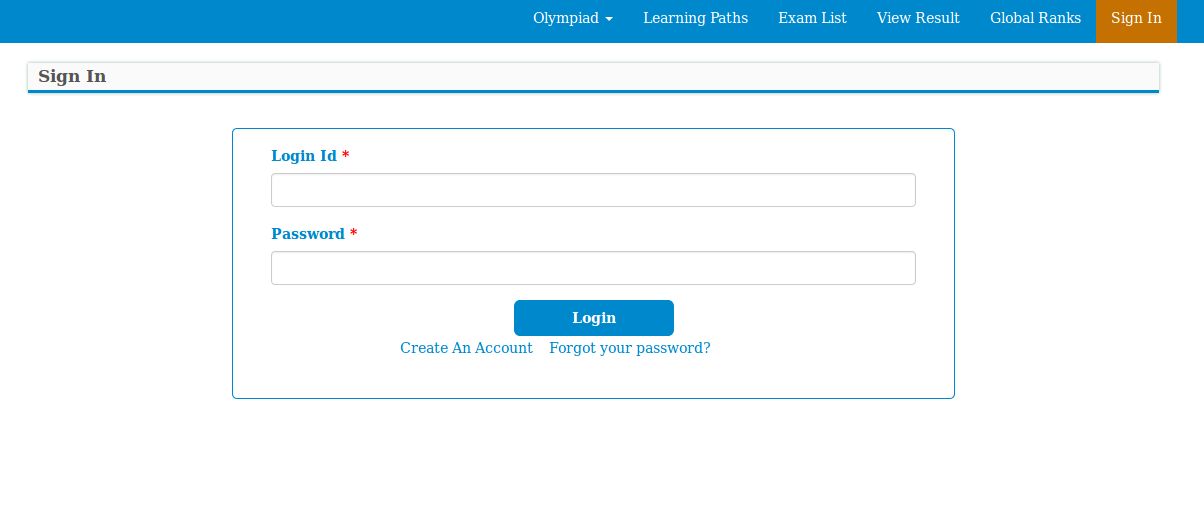
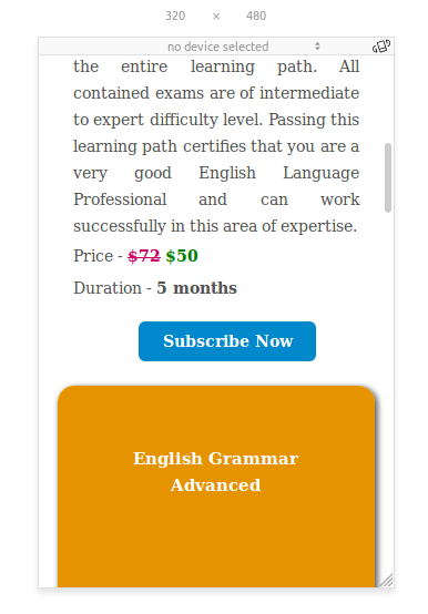
Above is the login form that is designed in bootstrap so that it looks different on every screen size. In the code “<div class="col-xs-12 col-sm-12 col-md-10 col-md-offset-1 col-lg-8 col-lg-offset-2 form-outer">” it can easily be seen that this form is going to occupy all the twelve blocks in the mobile view and that of the tablet view. In the small laptops the form will occupy ten columns with the offset of one column so that the form appears in the middle of the screen. If the offset was not given then the form would shift to the left.
In Large Desktops similar criteria is used but with lesser column space and greater offset.
Breakpoints Example :
@media only screen and (max-width: 1199px) and (min-width: 980px)  {
.ajax-certificate-name {top: 10%; padding: 10px; font-size: 16px;}
.ajax-certstatus-name { font-size: 16px;}
}
@media only screen and (max-width: 980px) and (min-width: 580px)  {
.start_button_learning {margin-left: 15%; width: 70%;}
}
@media only screen and (max-width: 580px) and (min-width: 420px)
.start_button_learning {margin-left: 39%; width: 22%;}
}
@media only screen and (max-width: 420px) and (min-width: 320px)  {
.start_button_learning {margin-left: 33%; width: 33%;}
.certificate_div{ width: 100%;}
.subscribe-button{margin-left: -51.5%;margin-top: 5%;}
}
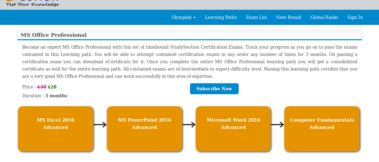
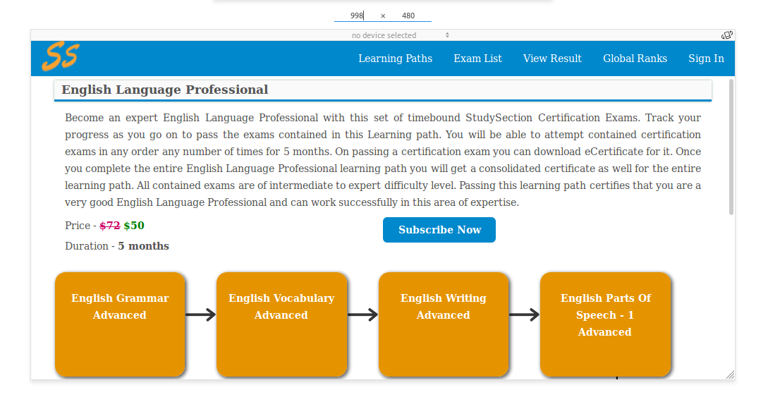
Screenshots: ( Large Screen)
( Medium Screen > 992px)
(Extra Small Screen <768px)