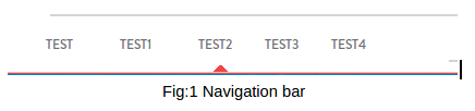
How to show Caret symbol on hover event in the Bootstrap navigation bar as shown in the figure below:
Solution: We created a bootstrap navigation bar with ul and li tags. One of the li element within the ul for reference is given below:
<ul class="row nav navbar-nav">
<li class="dropdown menu-large">
<a href="#" class="dropdown-toggle nav-active data-toggle="dropdown">

TEST2
</a>
</li>
….
…
…
</ul>
Add the following CSS code for the arrow on hover:
.nav-active:after
{
content: "";
position: absolute;
bottom: 0px;
left: 45%;
border-style: solid;
border-left: 5px solid transparent;
border-right: 5px solid transparent;
border-bottom: 5px solid red;
width: 0;
height:0;
z-index: 1;
}
Here we are using a box with zero width and height. The actual width and height of the arrow is determined by the width of the border that we have added. For a caret symbol, the bottom border is colored while the left and right are transparent hence giving a triangle effect.
Border-width property is used to specify the width of the border:
border-left: 5px solid transparent;
border-right: 5px solid transparent;
border-bottom: 5px solid red;
If you give each border a color, like in css code below, you will get a rectangle with each side having a color:
border-bottom: 15px solid black;
border-left: 15px solid green;
border-right: 15px solid red;
This is what you will see:

Now if we make the left and right borders transparent we will get this shape:

Some other key points: after – CSS selector is used to insert something after the content of selected element. As we need the caret symbol after every menu in the menu bar.
We have added .nav-active after selector to our CSS class. Nav-active is a default class provided by bootstrap to show highlight active menu in the Menu bar.
position absolute is used to put the caret symbol at the fixed location. left:45% is used to leave a margin of 45% from the left side, so always aligned centered to the selected menu element.